
shadcn/ui Theme Generator - Complete Theming Guide for Next.js 2026
Author
Muhammad Awais
Published
May 30, 2026
Reading Time
10 min read
Views
22.1k
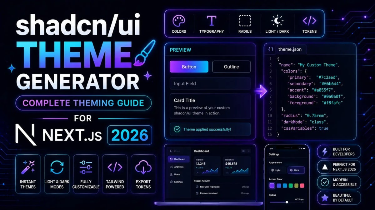
30 CSS Variables. Zero Idea Where to Start. Sound Familiar?
You run npx shadcn-ui@latest init, everything installs cleanly, and then you open globals.css. Thirty unfamiliar CSS variables stare back at you --primary, --muted-foreground, --ring, --accent all set to default gray values that look fine on the shadcn demo but completely wrong for your brand. You tweak one color, the dark mode breaks. You fix the dark mode, the hover states look off. An hour later you've made a mess of what should have been a 5-minute task.
I've been there too, on three different client projects in the last year alone. The problem isn't that shadcn/ui theming is hard it's that starting from scratch with HSL values is a terrible developer experience. In 2026, with shadcn/ui now the dominant UI stack for new Next.js projects, there's a much better way. Our free shadcn Theme Generator lets you pick a brand color, preview it live across real components, and copy production-ready CSS variables all in your browser, with no account needed.
This guide covers exactly how shadcn theming works under the hood, how to use the generator effectively, and the real-world patterns that keep your theme maintainable as your project grows.
How shadcn/ui's CSS variable system actually works (and why it's smarter than you think)
How to generate a complete brand theme in under 2 minutes using the free online tool
The exact
globals.cssstructure for Tailwind v4 in 2026Dark mode setup that doesn't flash or flicker on page load
The 5 theming mistakes that make projects unmaintainable
Advanced patterns: multi-brand themes, per-page overrides, and design token systems
How shadcn/ui Theming Actually Works
Before touching the generator, it's worth understanding the architecture because once you get it, everything else clicks immediately.
shadcn/ui doesn't use Tailwind color classes like bg-blue-500 directly. Instead, every component references semantic CSS variables names that describe role, not color. Here's what that looks like in the generated globals.css:
@layer base {
  :root {
    --background: 0 0% 100%;
    --foreground: 0 0% 3.9%;
    --primary: 221.2 83.2% 53.3%;
    --primary-foreground: 210 40% 98%;
    --secondary: 210 40% 96.1%;
    --secondary-foreground: 222.2 47.4% 11.2%;
    --muted: 210 40% 96.1%;
    --muted-foreground: 215.4 16.3% 46.9%;
    --accent: 210 40% 96.1%;
    --accent-foreground: 222.2 47.4% 11.2%;
    --destructive: 0 84.2% 60.2%;
    --destructive-foreground: 0 0% 98%;
    --border: 214.3 31.8% 91.4%;
    --input: 214.3 31.8% 91.4%;
    --ring: 221.2 83.2% 53.3%;
    --radius: 0.5rem;
  }

  .dark {
    --background: 222.2 84% 4.9%;
    --foreground: 210 40% 98%;
    --primary: 217.2 91.2% 59.8%;
    --primary-foreground: 222.2 47.4% 11.2%;
    /* ... rest of dark overrides */
  }
}
Values are in HSL format without the hsl() wrapper this is intentional. Tailwind reads them as raw channels and wraps them itself, which is what makes bg-primary/50 (50% opacity) work automatically without any extra configuration.
The key insight: to re-theme your entire app, you change these ~30 variables. Every Button, Card, Dialog, and Input automatically picks up the new values. No hunting through component files. No overriding class names. Just CSS variable assignment. That's the power of this system and why the theme generator workflow makes so much sense.
Generating Your Brand Theme in Under 2 Minutes
Here's the exact workflow I use on every new project. It takes about 90 seconds once you've done it once.
Open the generator. Head to our free shadcn Theme Generator. No signup, no install runs entirely in your browser.
Enter your brand color. Paste your primary brand color as a hex value (e.g.
#6366f1for indigo). The generator converts it to HSL and derives the full variable set primary, secondary, muted, accent, ring, border — automatically maintaining contrast ratios across all roles.Preview live. The preview shows your color applied across real shadcn components buttons, cards, inputs, badges, alerts. Toggle between light and dark mode to check both variants before committing.
Adjust the radius. Border radius is often overlooked but dramatically changes the feel of a UI. A
--radiusof0.25remfeels corporate and sharp.1remfeels friendly and modern.0.5remis the safe middle ground. Try all three in the preview before deciding.Copy the CSS output. Click copy you get the full
:rootand.darkblocks, ready to paste directly into yourglobals.css. Done. No manual color math, no contrast checking, no trial and error.
On a recent SaaS project, I went from fresh npx shadcn-ui@latest init to a fully branded UI in about 4 minutes total 2 minutes in the generator, 2 minutes pasting and verifying. That used to take me 45 minutes of manual variable tweaking. The difference is real.
Pasting Your Theme into globals.css - The Right Way for Tailwind v4
If you're on Tailwind v4 (which all new Next.js projects should be in 2026), there's one important structural change from v3. Tailwind v4 uses a CSS-first @theme block instead of tailwind.config.js. Your globals.css structure should look like this:
@import "tailwindcss";

@theme {
  /* Your custom design tokens go here */
  --font-sans: "Inter", sans-serif;
  --radius-lg: var(--radius);
}

@layer base {
  :root {
    --background: 0 0% 100%;
    --foreground: 0 0% 3.9%;
    --primary: 221.2 83.2% 53.3%;
    --primary-foreground: 210 40% 98%;
    --secondary: 210 40% 96.1%;
    --secondary-foreground: 222.2 47.4% 11.2%;
    --muted: 210 40% 96.1%;
    --muted-foreground: 215.4 16.3% 46.9%;
    --accent: 210 40% 96.1%;
    --accent-foreground: 222.2 47.4% 11.2%;
    --destructive: 0 84.2% 60.2%;
    --destructive-foreground: 0 0% 98%;
    --border: 214.3 31.8% 91.4%;
    --input: 214.3 31.8% 91.4%;
    --ring: 221.2 83.2% 53.3%;
    --radius: 0.5rem;
  }

  .dark {
    --background: 222.2 84% 4.9%;
    --foreground: 210 40% 98%;
    --primary: 217.2 91.2% 59.8%;
    --primary-foreground: 222.2 47.4% 11.2%;
    --secondary: 217.2 32.6% 17.5%;
    --secondary-foreground: 210 40% 98%;
    --muted: 217.2 32.6% 17.5%;
    --muted-foreground: 215 20.2% 65.1%;
    --accent: 217.2 32.6% 17.5%;
    --accent-foreground: 210 40% 98%;
    --destructive: 0 62.8% 30.6%;
    --destructive-foreground: 0 0% 98%;
    --border: 217.2 32.6% 17.5%;
    --input: 217.2 32.6% 17.5%;
    --ring: 224.3 76.3% 48%;
  }
}
Key difference from v3: the @tailwind base/components/utilities directives are replaced by a single @import "tailwindcss" at the top. If you're migrating an existing project, our guide on Tailwind v4 migration breaking changes covers every structural change in detail.
Dark Mode Setup That Doesn't Flash
Dark mode is where most shadcn theming goes wrong. The common mistake is adding dark mode without thinking about server-side rendering which gives you the dreaded white flash on load even when the user has dark mode set as their preference.
The correct setup uses next-themes with the suppressHydrationWarning attribute on your root HTML element. Here's the pattern that works reliably:
// app/layout.tsx
import { ThemeProvider } from "next-themes"

export default function RootLayout({
  children,
}: {
  children: React.ReactNode
}) {
  return (
    <html lang="en" suppressHydrationWarning>
      <body>
        <ThemeProvider
          attribute="class"
          defaultTheme="system"
          enableSystem
          disableTransitionOnChange
        >
          {children}
        </ThemeProvider>
      </body>
    </html>
  )
}
Three things matter here:
suppressHydrationWarningon the<html>tag : prevents React from complaining about the class mismatch between server and client render while the theme loads.attribute="class": tells next-themes to toggle a.darkclass on<html>, which is exactly what the shadcn CSS variable system expects.disableTransitionOnChange: prevents a jarring color transition when switching themes. You can remove this if you want animated transitions, but be careful about flash artifacts.
The theme toggle component itself is straightforward a simple button that calls setTheme("dark") or setTheme("light") from the useTheme hook. What matters is the setup above; the toggle is just a UI layer on top of it.
The 5 Theming Mistakes That Make Projects Unmaintainable
I've reviewed enough codebases to know these patterns cause pain consistently. Avoid them from the start retrofitting is much harder than getting it right the first time.
Mistake 1 - Hardcoding Tailwind color classes instead of semantic variables. Using
bg-indigo-600instead ofbg-primarymeans when you rebrand or the client changes their brand color, you're doing a global find-and-replace instead of changing one CSS variable. Always use semantic classes in your components. Reserve specific palette classes for one-off decorative elements only.Mistake 2 - Only customizing the light theme and forgetting dark. The generator handles this for you it derives both
:rootand.darkfrom your brand color. But if you're manually tweaking variables afterward, always update both blocks. A mismatch where light mode looks polished and dark mode looks default is immediately noticeable to users.Mistake 3 - Editing shadcn component source files directly. shadcn copies component code into your project so you can edit it but that doesn't mean you should do it for theming purposes. Theme customization belongs in
globals.css, not scattered through component files. Editing components directly means every futurenpx shadcn-ui@latest addupdate becomes a manual merge conflict.Mistake 4 - Using arbitrary Tailwind values for theme colors.
bg-[#6366f1]might seem convenient but it bypasses the entire CSS variable system. That color won't respond to dark mode, it won't update when you change your brand color, and it creates invisible coupling in your component files. Map custom colors to CSS variables inglobals.cssfirst, then reference them through the Tailwind theme config or the@themeblock in Tailwind v4.Mistake 5 - Setting
--radiusinconsistently. One--radiusvalue drives all component rounding throughcalc(var(--radius) - 2px)and similar derived values in the component source code. If you override individual components with their own border-radius values, the system loses coherence and components start looking like they came from different UI kits. Set--radiusonce inglobals.cssand let it cascade.
Advanced Pattern: Per-Section Theme Overrides
Here's a technique that most tutorials don't cover: you can apply different themes to different sections of your page by scoping CSS variable overrides to a container class. This is useful for landing pages that have a dark hero section and a light content section, or admin dashboards with a colored sidebar.
/* globals.css */
.theme-dark-section {
  --background: 222.2 84% 4.9%;
  --foreground: 210 40% 98%;
  --primary: 217.2 91.2% 59.8%;
  --card: 222.2 84% 4.9%;
  --card-foreground: 210 40% 98%;
  --border: 217.2 32.6% 17.5%;
}
// HeroSection.tsx
export function HeroSection() {
return (
<section className="theme-dark-section bg-background text-foreground py-24">
<h1 className="text-foreground">Build faster.</h1>
<Button>Get started</Button> {/* uses --primary from .theme-dark-section */}
</section>
)
}The Button inside that section automatically uses the dark section's primary color no className overrides, no prop drilling, no theme context switching. Pure CSS cascade doing exactly what it's designed to do.
You can generate the CSS for these section overrides using our shadcn Theme Generator by generating a secondary theme palette and copying just the variables you need for the override block.
Tools That Complete the shadcn Workflow
The theme generator is the starting point. Here are the other tools that complete the workflow from design to shipped component:
shadcn Theme Generator : Pick a brand color, get a complete CSS variable set for light and dark mode. 100% browser-based, no data sent anywhere.
CSS to Tailwind Converter : When you get design specs as raw CSS (from Figma exports or a designer's handoff), this converts them to Tailwind utility classes instantly. Pair it with the theme generator for a complete design-to-code pipeline.
Tailwind SVG Background Generator : Need a subtle patterned background for a hero section or card? This generates Tailwind-compatible SVG backgrounds that use your CSS variables, so they automatically adapt to your theme and dark mode.
Conclusion
shadcn/ui's CSS variable theming system is genuinely well-designed semantic roles, clean cascade, automatic dark mode through class toggling. The only friction point was the starting experience: 30 unfamiliar variables with no visual preview. That's exactly what the theme generator solves.
The workflow is straightforward: generate from a brand color, preview live, paste into globals.css, set up next-themes for dark mode, and never touch component source files for theming purposes. Follow those four steps and you get a consistent, maintainable theme that scales as your project grows.
Try it now open the free shadcn Theme Generator, paste your brand color, and have a production-ready theme in your clipboard in under two minutes. No account, no install, works in any browser.
Frequently Asked Questions
What is a shadcn/ui theme generator?
A shadcn/ui theme generator is a tool that takes an input color usually your brand's primary hex value and automatically derives a complete set of CSS variables for the shadcn/ui theming system. Instead of manually calculating HSL values for --primary, --secondary, --muted, --accent, --ring, and their dark mode counterparts, the generator does all the color math and contrast checking for you. The output is a ready-to-paste CSS block that goes directly into your globals.css.
How do I customize shadcn/ui colors in Next.js?
Open your app/globals.css file and find the :root block inside @layer base. Each CSS variable controls a semantic color role across all shadcn components. Change --primary to update all primary buttons, focus rings, and active states at once. Always update the matching .dark block as well to keep dark mode consistent. Use our shadcn Theme Generator to generate both blocks from a single brand color automatically.
What is the difference between --primary and --accent in shadcn/ui?
--primary is your main brand color used for primary buttons, active states, and interactive focus indicators. It should be your most prominent, high-contrast color. --accent is a softer version used for hover backgrounds, subtle highlights, and non-interactive emphasis. In the default theme they're the same hue at different lightness values. A common pattern is to keep --accent close to --muted for a calm UI, and make --primary significantly more saturated so interactive elements pop clearly.
Does the shadcn theme work with Tailwind CSS v4?
Yes, but the file structure changed. In Tailwind v4, you replace the three @tailwind base/components/utilities directives with a single @import "tailwindcss"; at the top of globals.css. The shadcn CSS variable block itself goes inside @layer base exactly as before that part is unchanged. A new @theme block above it is where you add Tailwind-specific token overrides like custom fonts and extended spacing.
Why does my dark mode flash on page load in Next.js?
This happens because Next.js renders HTML on the server before the client JavaScript runs so the initial HTML doesn't know the user's preferred theme. The fix is to add suppressHydrationWarning to your root <html> tag and use next-themes with attribute="class". This tells React to allow the class mismatch while hydration catches up, eliminating the flash. The disableTransitionOnChange prop on ThemeProvider also helps by preventing animated transitions during the initial load.
Can I have multiple themes in one shadcn/ui project?
Yes. scope CSS variable overrides to a container class instead of :root. For example, adding a .theme-ocean class to a section element and defining different --primary and --accent values inside that class will override the root theme for all shadcn components within that section. This is a clean way to create dark hero sections, colored sidebars, or per-tenant branding in multi-tenant SaaS apps without any JavaScript theme-switching logic.
Is the shadcn Theme Generator free? Does it send my data anywhere?
Yes, the shadcn Theme Generator on WebToolsHub is completely free to use with no account or signup required. All processing runs 100% client-side in your browser using JavaScript. Your color inputs and generated output are never sent to any server, logged, or stored anywhere. This makes it safe to use with proprietary brand colors or client project details.
Tagged in
Continue Reading
All Articles

Level Up Your Workflow
Free tools mentioned in this article
Regex Tester & Debugger
Test, debug, and validate JavaScript regular expressions instantly. Live match highlighting, capture groups, all flags supported - free, client-side, zero logs.
SVG Path Builder & Visualizer
An interactive, client-side SVG path builder and visualizer tool. Generate optimized cubic and quadratic Bezier vector code instantly on a grid canvas.
Stripe & PayPal Fee Calculator
Calculate the exact Stripe and PayPal transaction fees for US and UK markets. A free developer tool to estimate SaaS payouts, merchant costs, and revenues.
WebMCP Tool Schema Generator
Generate declarative HTML form structures or imperative JavaScript/TypeScript schemas to register local web tools with AI browser agents.