
Clean Brutalism: The Minimalist SaaS UI Design Trend of 2026
Author
Muhammad Awais
Published
May 19, 2026
Reading Time
5 min read
Views
142.2k
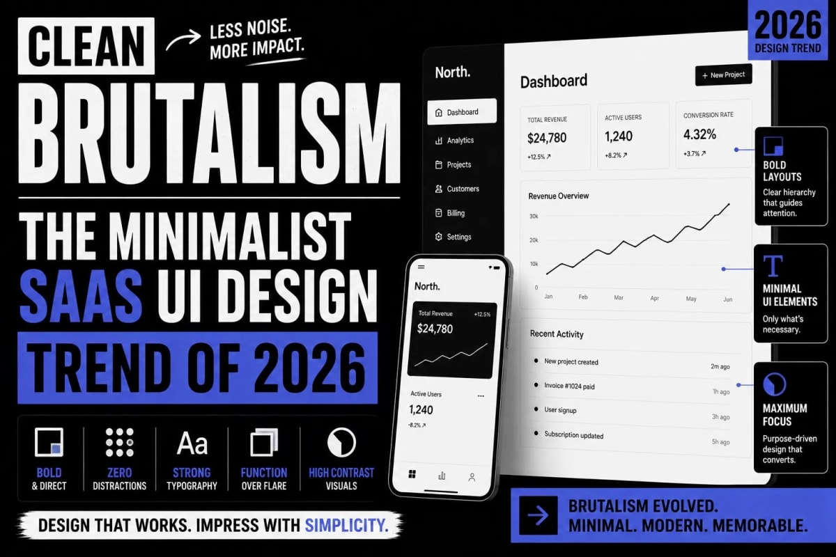
The era of heavily shadowed, glowing, and gradient-filled interfaces is officially over. For years, designers relied on "Neumorphism" and soft UI to make applications look friendly. However, as users became overwhelmed by digital noise, top-tier startups began stripping away everything that was not purely functional. Welcome to 2026, the year where Clean Brutalism and Minimalist SaaS UI Design have completely taken over the software industry. It is a design philosophy that favors raw functionality, stark borders, and high-contrast typography over visual decorations.
1. What Exactly is Clean Brutalism?
Originating from post-war architecture, traditional brutalism was about exposing the raw materials of a building—concrete, steel, and utility pipes. In the digital world, brutalist web design translates to exposing the raw structure of a website. It completely abandons CSS drop-shadows (box-shadow), rounded pills (border-radius: 9999px), and complex background blur effects.
However, traditional web brutalism was often chaotic, featuring jarring colors and intentionally ugly layouts. "Clean Brutalism" is the refined, corporate cousin of this movement. It takes the structural honesty of brutalism but pairs it with the mathematical precision of modern minimalism. The result is an interface that looks highly engineered, trustworthy, and lightning-fast to navigate.
If you look at the fastest-growing dev-tools and B2B SaaS platforms today, they all share this exact aesthetic: 1px solid borders, sharp or slightly rounded corners (rounded-sm), monochromatic color palettes (mostly Zinc or Slate scales), and a heavy reliance on typography to establish hierarchy rather than colored boxes.
2. The 3 Core Pillars of Minimalist SaaS Design
If you want to implement this trending UI design trend into your own Next.js or React application, you must strictly adhere to three foundational rules. Breaking these rules will result in an interface that looks confused rather than intentional.
- The Death of the Box Shadow: Do not use shadows to indicate depth. Instead, use 1px solid borders (e.g.,
border-zinc-200 dark:border-zinc-800). When a user hovers over a card or button, invert the background color or thicken the border rather than making the element "float". - High-Contrast Monochromatic Scales: Clean brutalism rarely uses more than one accent color. The entire application should be built using a grayscale palette (like Tailwind's Zinc). The background should be stark white (
bg-white) or off-white (bg-zinc-50), and the text should be almost black (text-zinc-900). This extreme contrast ensures perfect readability. - Structural Typography: Because you are removing colorful backgrounds and soft shadows, your typography must do the heavy lifting. Use strong, geometric sans-serif fonts like Inter, Roboto Mono, or Geist. Make your headings massively oversized to create a clear visual hierarchy.
3. Why Developers and Solo Founders Love It
For indie hackers and solo founders, Clean Brutalism is a superpower. Designing a "beautiful" soft UI requires hours of tweaking gradients, balancing shadow opacities, and testing color harmony. It is a massive drain on development time. Clean brutalism operates on strict logical constraints. You define your border width, your padding scales, and your typography sizes, and you simply reuse them everywhere.
Furthermore, removing complex CSS properties like backdrop-filter and large layered shadows significantly improves frontend rendering performance. The DOM paints faster, the CSS payload is lighter, and transitioning between Dark Mode and Light Mode becomes mathematically perfect because you only have to invert background and text colors without worrying about how shadows will look on a dark background.
The Impact on SaaS Conversion Rates
Does removing pretty colors hurt sales? The data says the exact opposite. Minimalist SaaS design aggressively forces the user's attention toward the actual data and the primary Call-To-Action (CTA) buttons. When your interface is stripped of visual distractions, the user's cognitive load drops dramatically. They can read your pricing table faster, understand your feature list clearer, and click your checkout button with zero hesitation. In the B2B sector, an interface that looks highly engineered and "serious" directly correlates with higher perceived software reliability.
Conclusion: Embrace the Constraints
If you are building a new software tool in 2026, stop trying to make it look like a glossy consumer app. Embrace the raw, technical aesthetic of Clean Brutalism. Use hard borders, sharp corners, and stark contrast. Let your product's functionality be the star of the show, not your CSS shadow skills.
Frequently Asked Questions
Is Clean Brutalism the same as Web 1.0?
No. While Web 1.0 was minimal by necessity due to technological limits, Clean Brutalism is a deliberate aesthetic choice. It utilizes modern typography, precise grid systems, and smooth reactive components (like React or Next.js) that Web 1.0 never had.
Why is Tailwind CSS good for brutalist design?
Tailwind CSS excels here because brutalism relies on strict adherence to a utility system. By using Tailwind's default Zinc or Slate palettes and strict spacing scales, you can build a highly consistent, structural UI without writing custom CSS classes.
How do I make my primary buttons stand out without shadows?
In a brutalist UI, contrast is your weapon. If your entire app is white and light gray, make your primary CTA button solid black (or your single accent color) with a sharp 1px border. The sheer contrast will draw the user's eye instantly.
Tagged in
Continue Reading
All Articles


Level Up Your Workflow
Free tools mentioned in this article
Robots.txt & LLMs.txt Generator
Generate robots.txt and llms.txt files instantly with AI bot presets for GPTBot, ClaudeBot, and PerplexityBot. Control who crawls your site in 2026.
Tailwind SVG Background Pattern Generator
The ultimate visual builder for Dot Grids, Plus Signs, and geometric SVG background patterns. Generate optimized Tailwind CSS classes for your SaaS landing pages.
SVG Path Builder & Visualizer
An interactive, client-side SVG path builder and visualizer tool. Generate optimized cubic and quadratic Bezier vector code instantly on a grid canvas.
Image Resizer & Compressor
Compress image to 20KB, 50KB, or 100KB online free instantly reduce image size in KB for government forms, exams (UPSC, SSC, FPSC, NTS), passport photos, and more. Works entirely in your browser.